Lawrence Florist Mockup

UX Redesign Case Study: Lawrence Florist website

Overview

Lawrence Florist is a local flower shop with a heartfelt mission: brighten life's everyday moments through meaningful floral arrangements and personalized service.

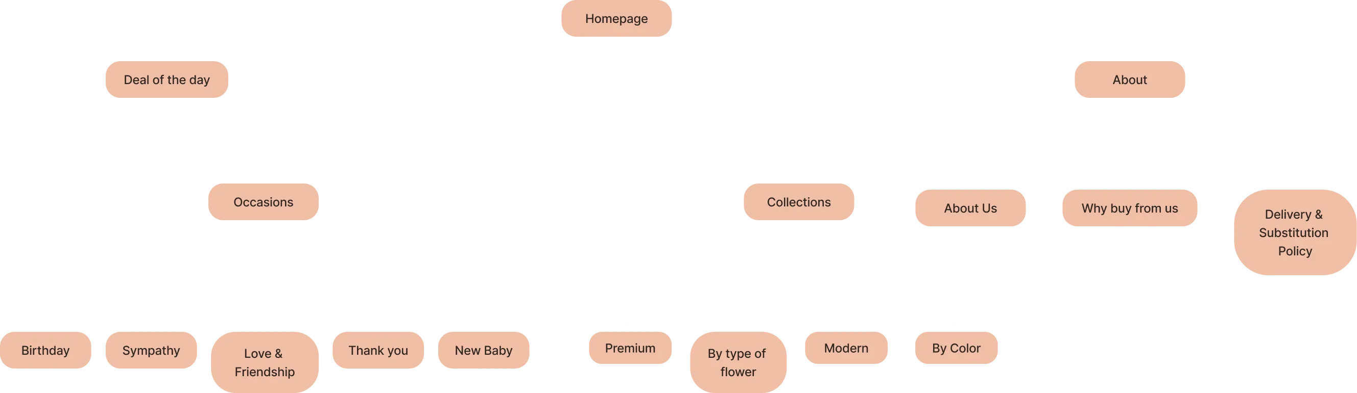
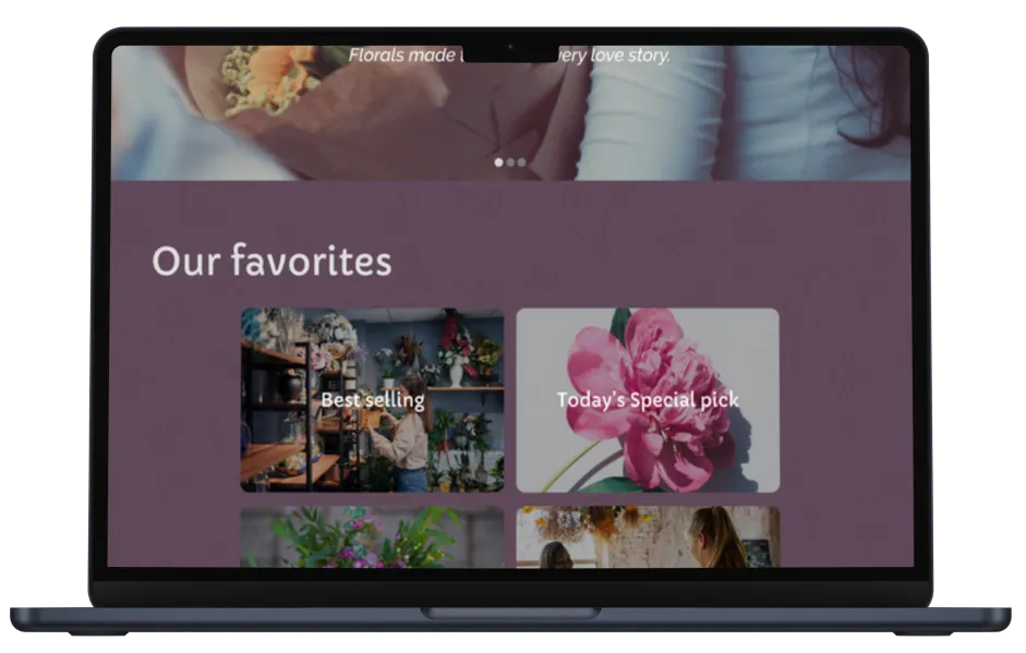
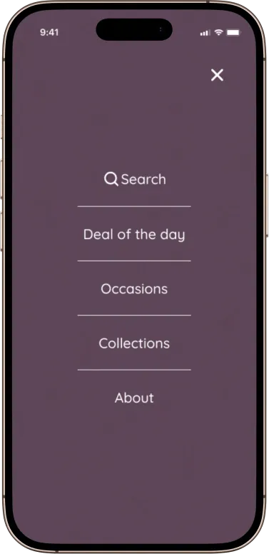
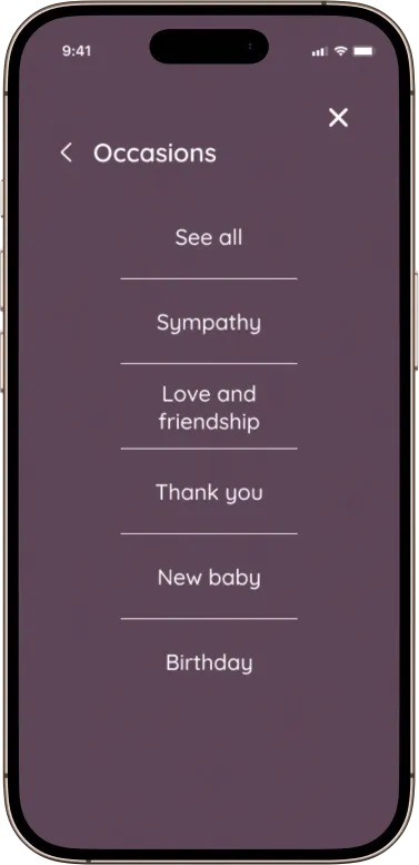
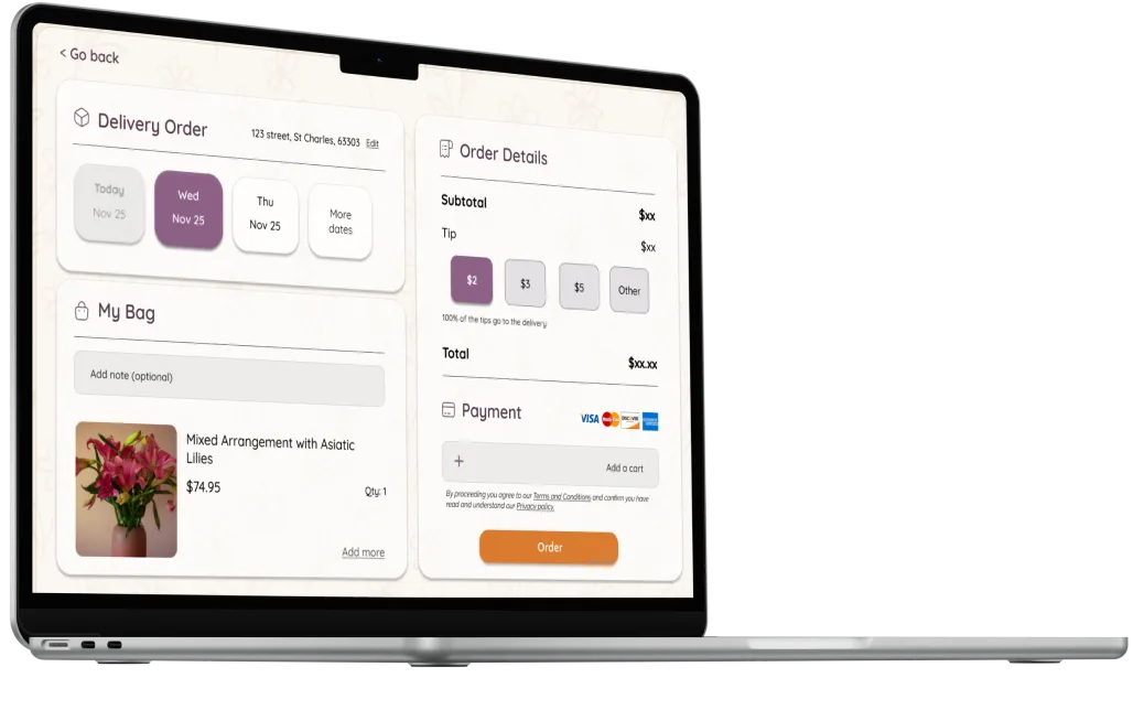
First problem: Hierarchy

The existing website experience fell short of customer expectations, including: poor navigation, weak visual hierarchy, outdated design patterns. Made it difficult to user to complete purchases.

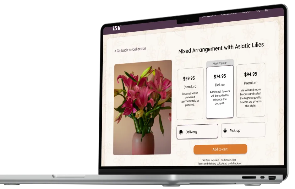
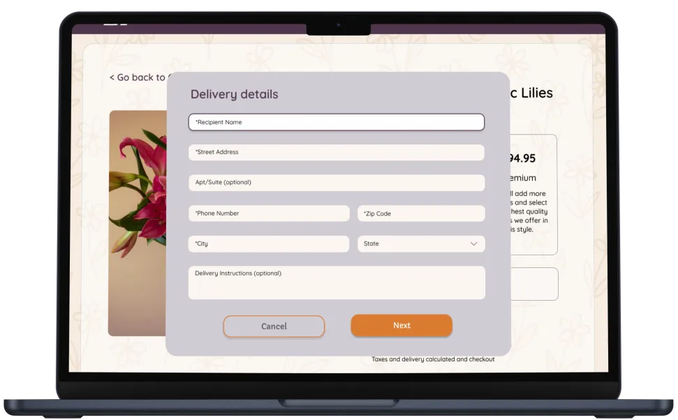
The goal was to reduce cart abandonment by 20%.

Navigation menu interaction showing poor usability and confusing user flow

Information Architecture

A new sitemap was developed to simplify navigation, clarify product categories, and align with user intent.

Sitemap Information Architecture

Click to expand site map.

The solution

To reduce cart abandonment, the website was redesigned with a user-centered checkout flow that prioritizes clarity, speed, and trust.

The solution introduced a simplified cart layout, clear calls-to-action, transparent cost breakdowns, and fewer required steps to complete a purchase. These changes minimize hesitation and decision fatigue, encouraging users to complete checkout and supporting the goal of a 20% reduction in abandonment.

Improved navigation solution showing clear user flow and intuitive design

Second problem: Inconsistent UI

Through user research and heuristic evaluation, we identified critical pain points that were blocking conversions and creating frustration.

Research Insights

⚠️ Pain Points 💡 Opportunities
01 Lack of real-time feedback for user actions Introduce visual feedback and confirmation cues
02 Unclear and generic product categorization Create intuitive, user-centered categories
03 Inconsistent UI components and typography Apply a unified visual style guide across the site

Design System & UI Kit

A cohesive design system was created to ensure consistency across all touchpoints and streamline future development.

Color Palette

Color Palette

Color palette was tested for WCAG AA accessibility compliance.

Typography

Typography Guide

Interaction & Buttons

Button States

Homepage Mockups

High-fidelity mockups showcasing the redesigned homepage with improved visual hierarchy and user experience.

Process 1

Homepage Design

Clean layout with intuitive navigation and clear visual hierarchy to guide users through their floral shopping journey.

Process 2

Refined Interface

Modern design system with consistent typography, spacing, and color palette that reflects the warmth of the brand.

Final 1

Our Favorites Section

Curated collection showcase with emotional appeal and simplified product discovery to inspire purchases.

Final 2

New Collection

Featured products with clear imagery and pricing upfront, removing friction from the shopping experience.

Adding Responsiveness

Mobile-first approach ensuring seamless experience across all devices with optimized layouts and touch-friendly interactions.

iPhone Home
iPhone Search Menu
iPhone Categories
iPhone Favorites

Results

The redesign focused on clarity, emotion, and ease of use—turning a dated online flower shop into a warm, modern shopping experience.

The improvements touched every layer of the brand, from visual identity to UX structure and user trust.

  • Simplified navigation and clear hierarchy for faster decision-making.
  • Emotionally driven messaging to build connection and loyalty.
  • Refreshed product pages with delivery info upfront.
  • Cohesive visual identity that appeals to a younger, design-aware audience.
Product Detail View Delivery Form View Checkout View
× Enlarged view