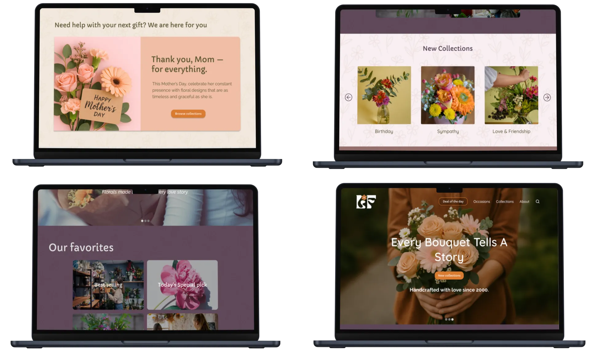
UX redesign
case study
Making it easier to find, choose, and order flowers for a local florist's e-commerce site

Making it easier to find, choose, and order flowers for a local florist's e-commerce site
A beautiful product, hidden behind a difficult experience
The previous website was overwhelming and confusing. Visitors had trouble browsing arrangements and often gave up before finding the perfect bouquet.

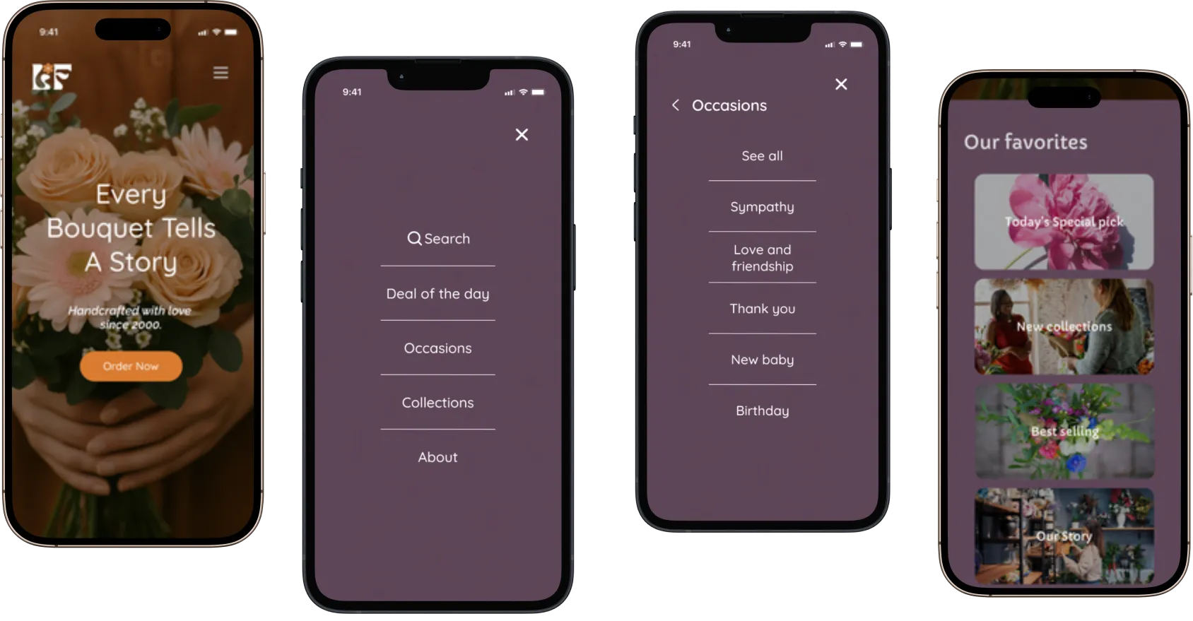

The goal was to reduce cart abandonment by 20% by creating a faster, easier, and more transparent checkout experience.
Baymard Institute found that 18% of shoppers abandon purchases because checkout feels too long or complicated. This reinforced the opportunity to simplify the experience and help customers move from product selection to order confirmation with less effort.
Baymard Institute - Cart Abandonment Rate Statistics
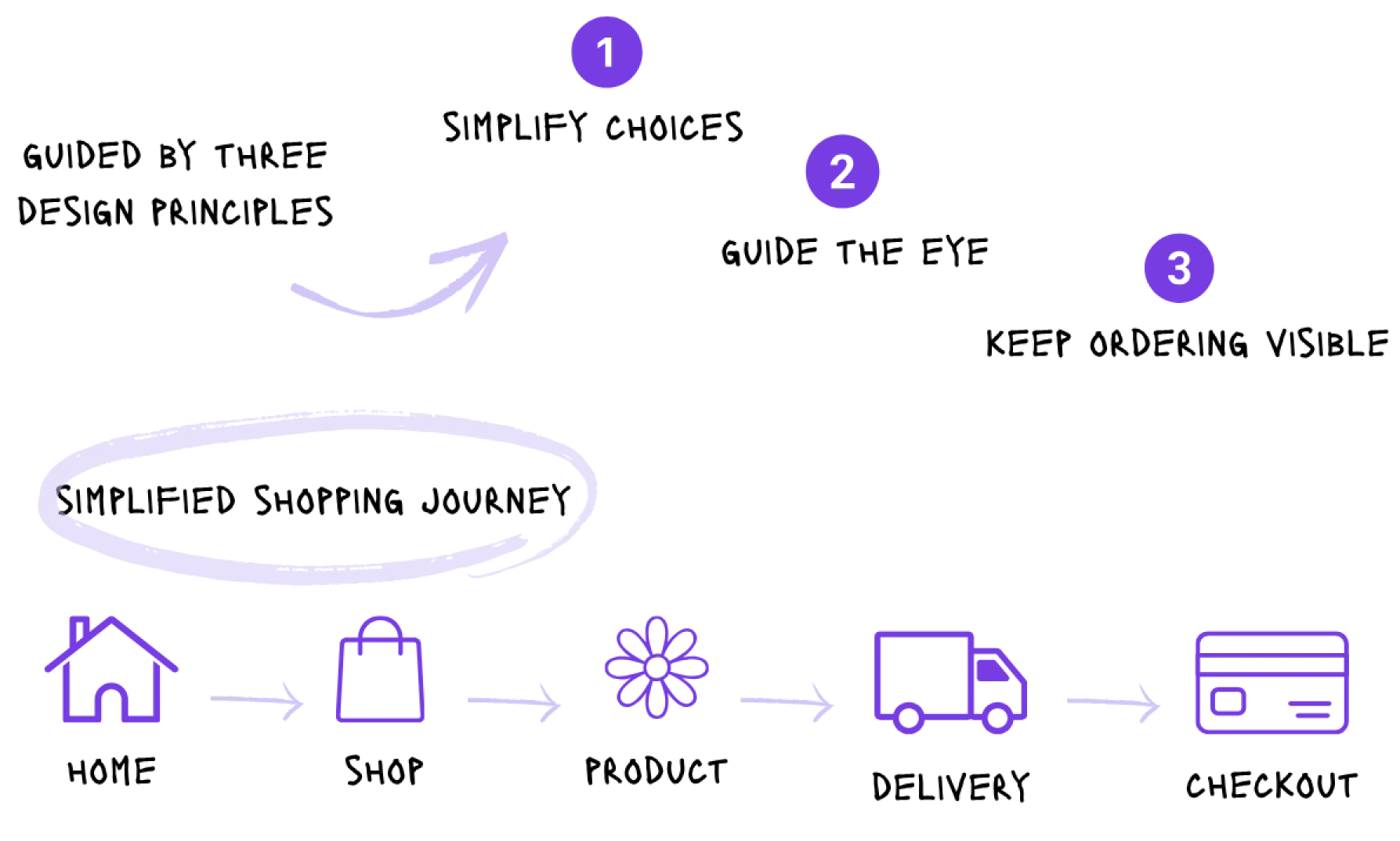

A simplified experience helps user focus on who matters most
A guided flow makes it easy to move from browsing to placing an order
When visuals and consistent details reflect the care behind every arrangement