Pick-up order
feature design
Making frozen custard easier to order, personalize and pick up.
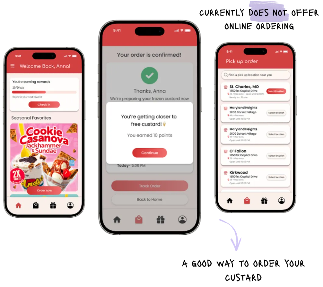
Making frozen custard easier to order, personalize and pick up.
The app rewarded loyal customers but stopped short of letting them order.
Mobile-first customers faced limited convenience, persistent authentication issues, and no way to place pick up orders, forcing them back in line instead of staying in the app.


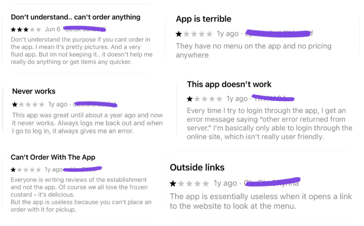
Recurring complaints revealed three key issues:
Users couldn't place orders directly in the app, experienced frequent errors and logouts, and were redirected to external pages to view the menu.
These insights confirmed the need for a simpler, more reliable in-app ordering experience.
of global web traffic comes from mobile device.
of consumers prefer one app for delivery, pickup, and reservations.
StatCounter Global Stats, July 2026, DoorDash 2026 Restaurant Industry Trends Report
Users couldn't order ahead in the app. They had to wait in line, even during busy hours
Frequent password resets and failed logins created frustration and drop-offs
Rewards, info, and menu items were confusing, making it hard to find what matters
The gap wasn't the menu.
It was the path to purchase
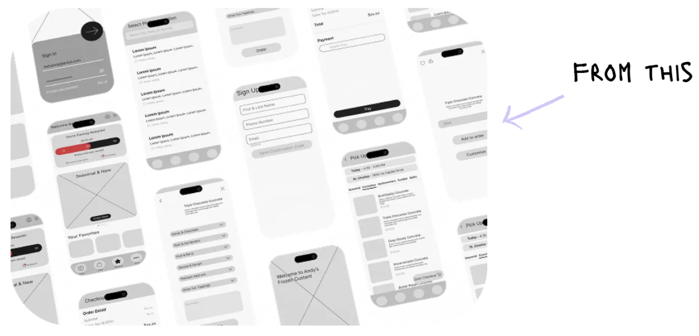
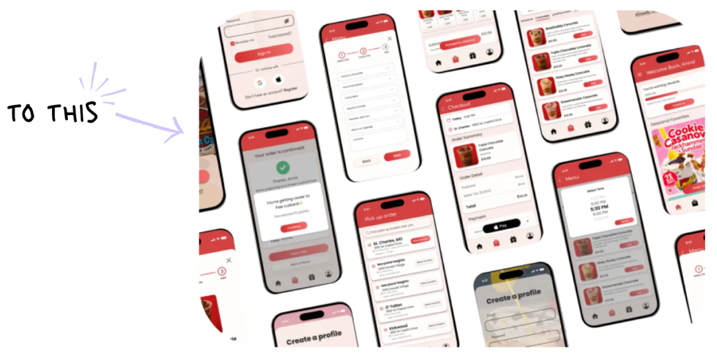
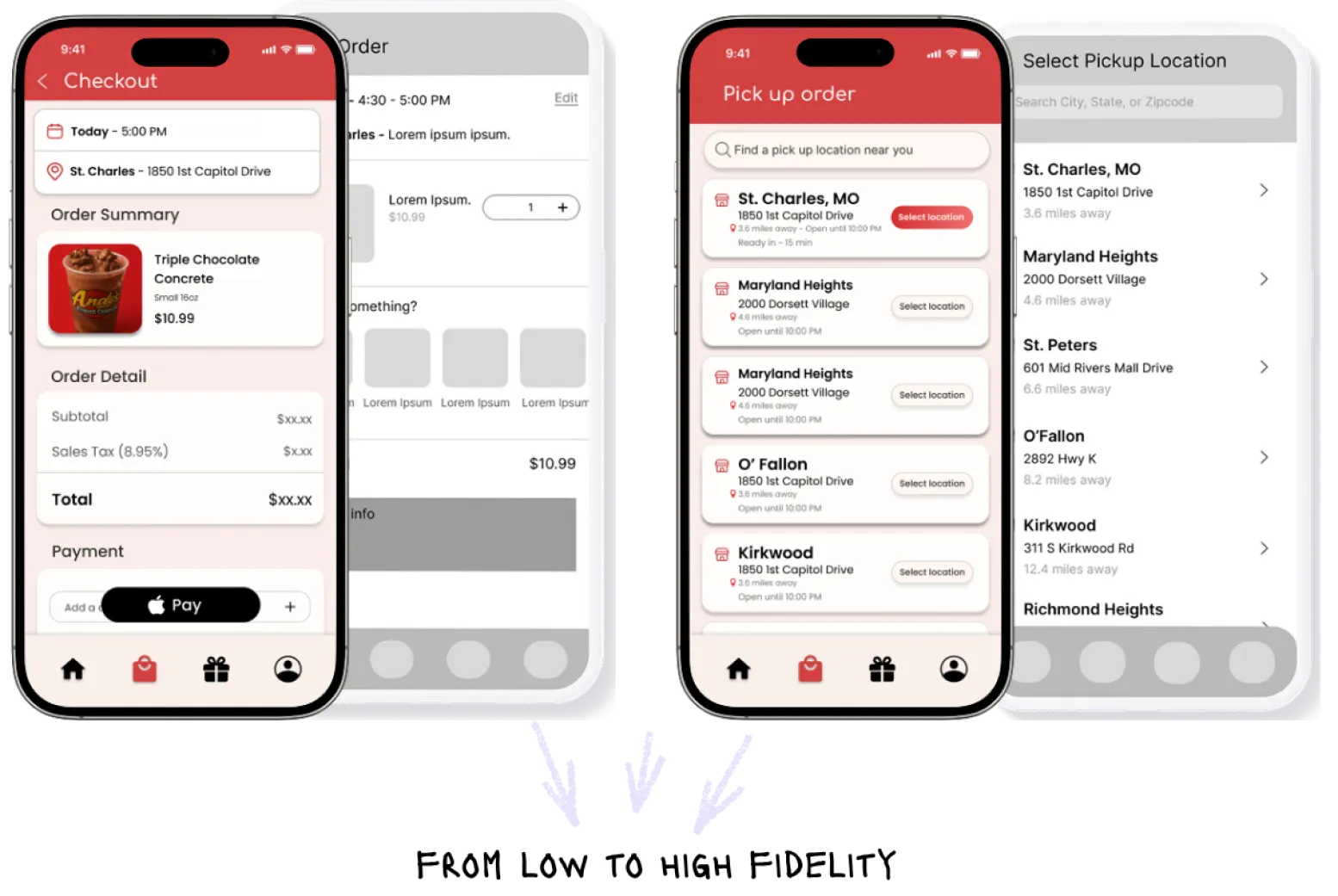
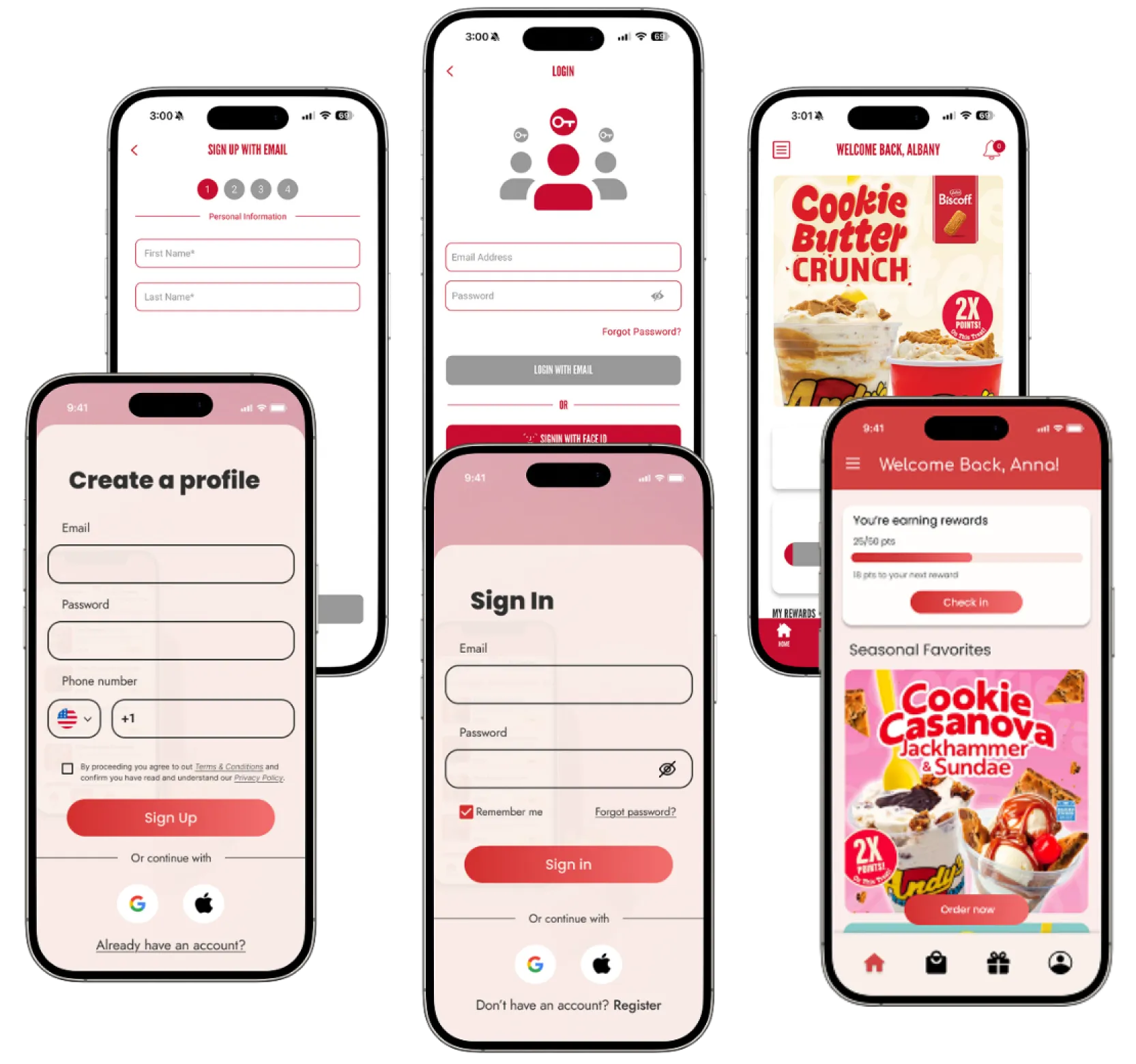
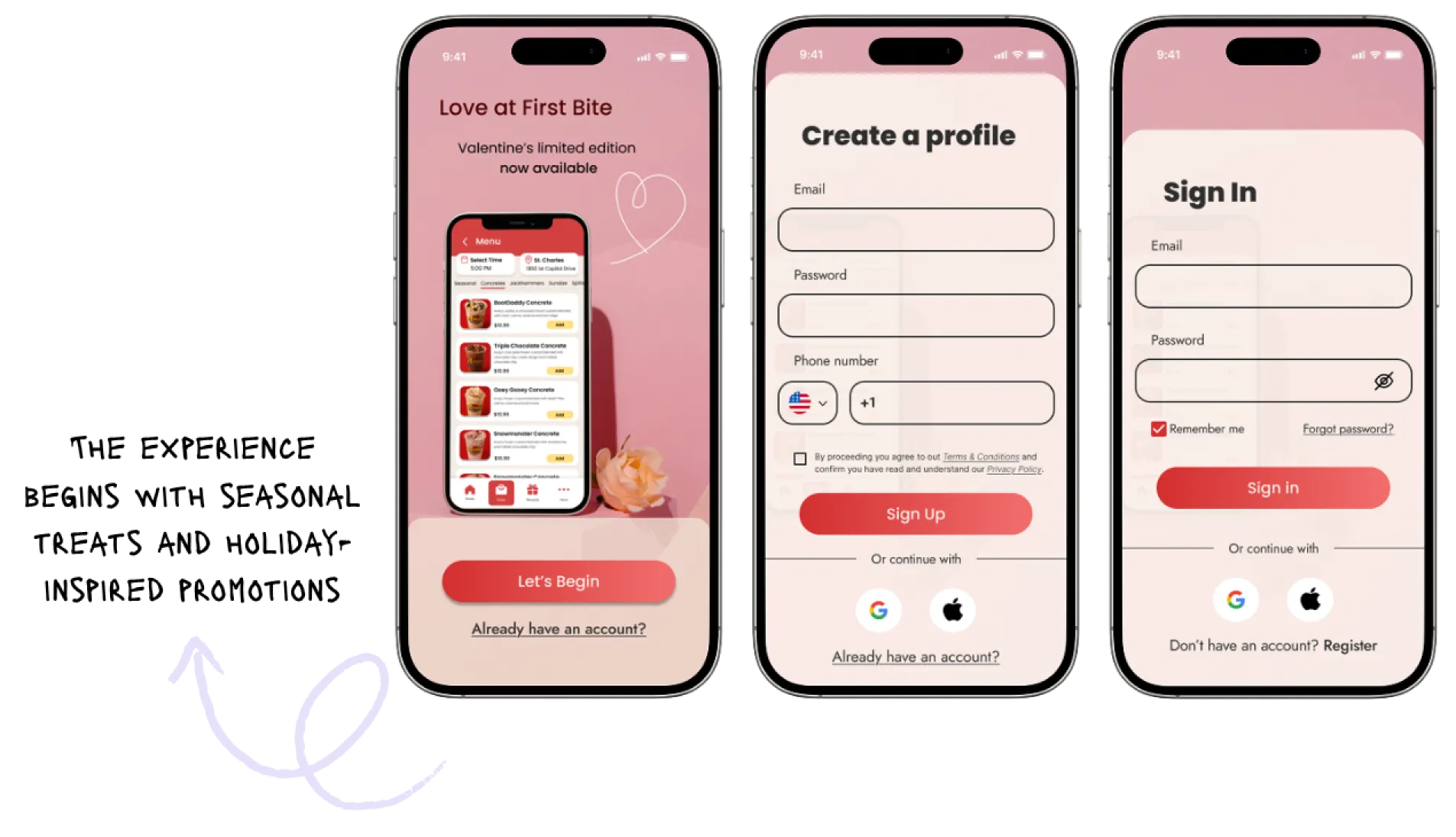
The redesign turns a limiting rewards app into a complete ordering experience.
Faster path to purchase
Clearer ordering decisions
Personalized pickup
Loyalty built into checkout