The brand
identity is the
soul of a brand
A playful coffee brand for people whose best ideas begin with one good pause
A playful coffee brand for people whose best ideas begin with one good pause
What if coffee wasn't about productivity… but giving yourself a permission to pause? (with or without caffeine)
Gimme a Break is a reminder that taking a break isn't wasting time. It's where the good ideas actually comes from.
A June 2026 survey of 1,000 U.S. coffee consumers found that:
Consider coffee part of their daily routine
Drink it for energy
say it helps them relax
Associate coffee with increased productivity
Source: Drive Research Coffee Consumer Survey
The idea started with one simple idea: life feels different before and after coffee.
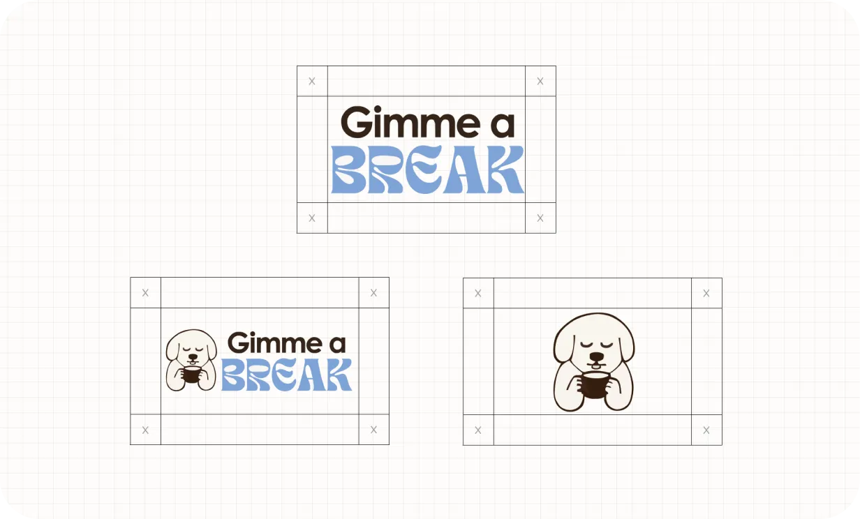
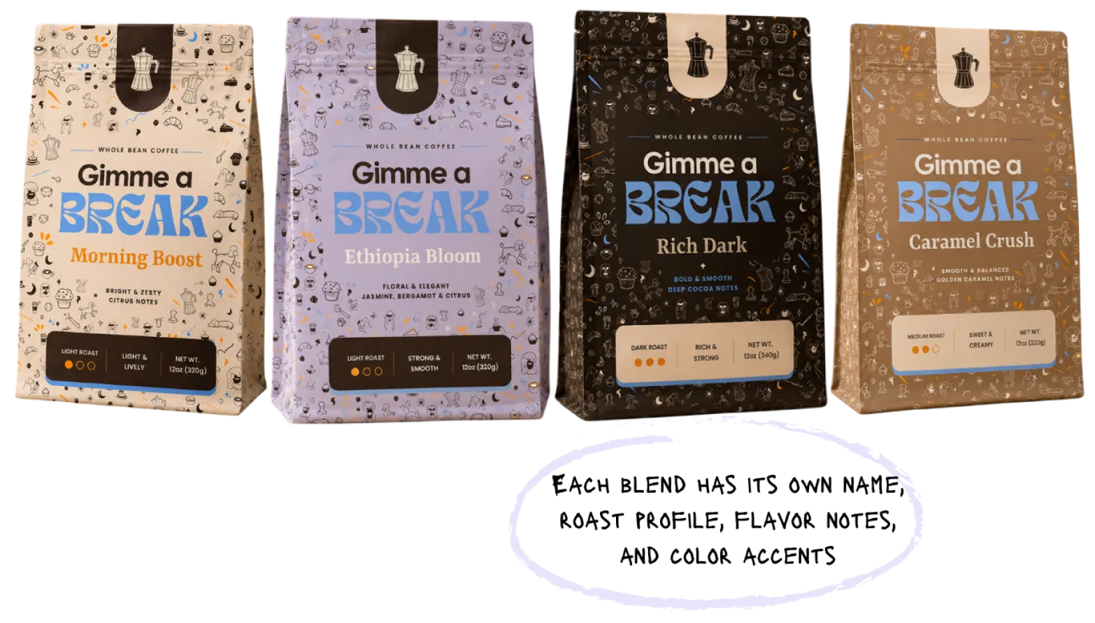
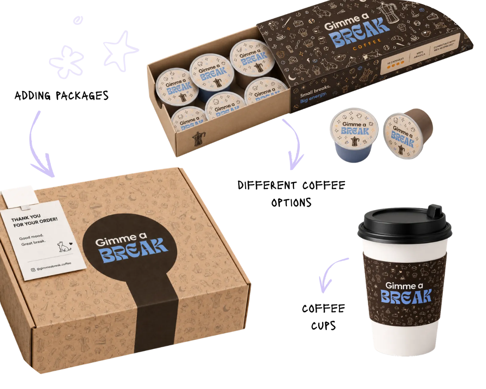
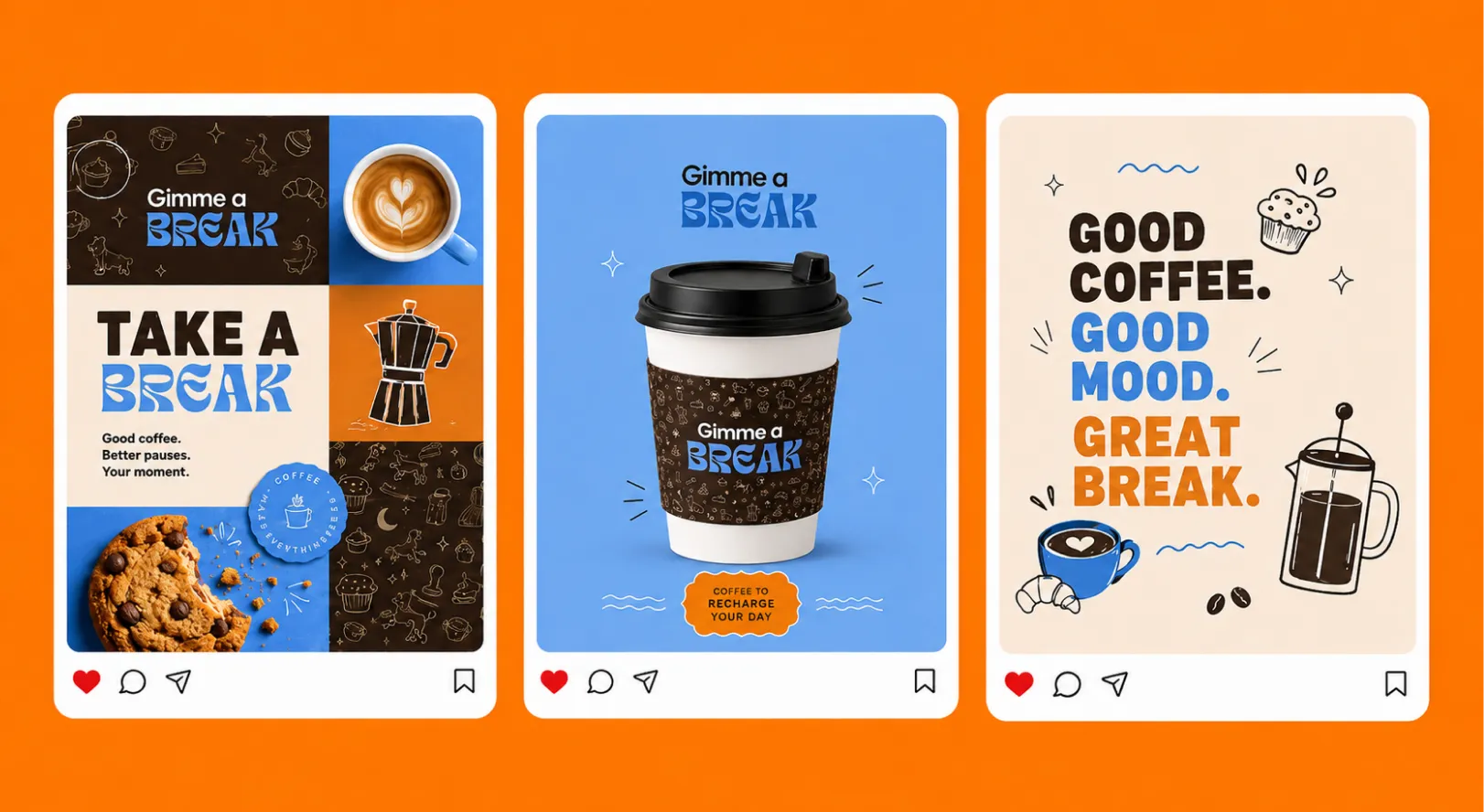
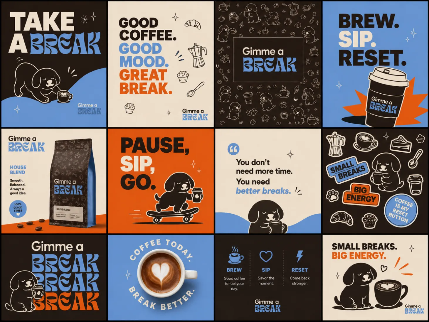
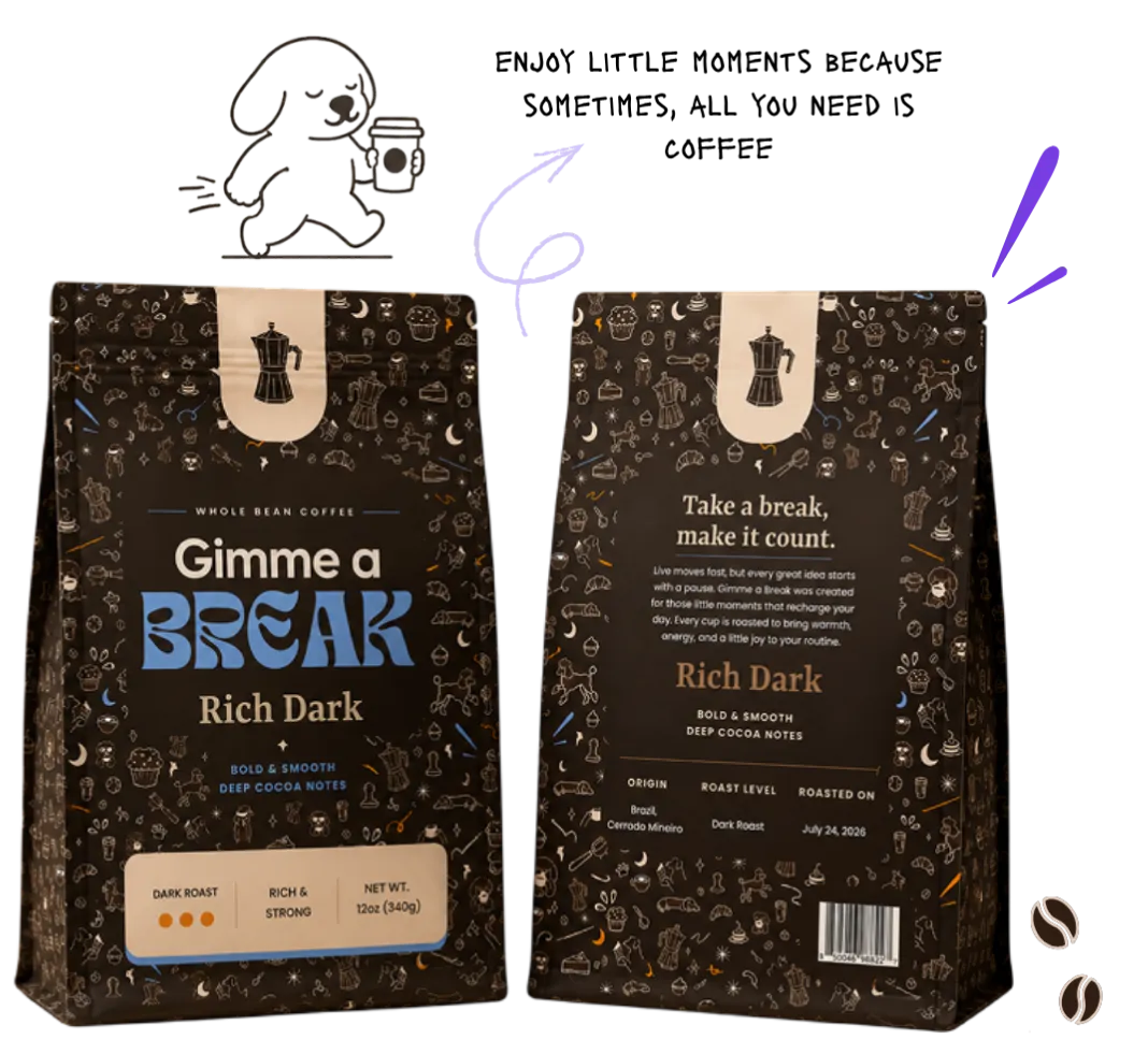
Each format maintains the same playful personality through consistent colors, typography, patterns, and brand details.
This flexible system allows the brand to introduce new products while remaining cohesive and instantly recognizable.